Branding agency: the sequence that produces the mark, not just the mark

Branding Agency
Almost every agency shows the result. We show the sequence that produced it.
A visual identity without a documented chain of decisions won’t survive a change of marketing manager, won’t hold up in front of a skeptical board, and won’t last when an outside supplier has to apply it two years later.
The method in practice
From guiding words to a defensible logotype
-
Words
The brief becomes guiding words. Every shape must be traceable to a word. If it isn’t, it’s decoration.
-
Territory
The words are grouped into brand territories. Each territory guides a visual choice: color, shape, typeface.
-
Mark
The central mark emerges from the territories. It isn’t an aesthetic proposal: it’s an answer to a definition already given.
-
Standard
The system is codified. Fonts, colors, applications across every touchpoint. Without the standard, the identity falls apart at the first outside supplier.
On All3XYHealth we started from six words: harmony, rhythm, balance, expertise, wellbeing, beauty. We reduced them to four brand territories. Those territories gave us five colors, each with a declared origin, and two typefaces with distinct roles.
Acumin Pro Wide Extra Light carries the science. Denton Text carries the wellbeing. Two typefaces, two worlds, within a single logotype. This chain — from word to mark — is what we publish. The market shows the finished logo. We show why it’s that one and not another.

Visual identity portfolio
How many decisions make up a visual identity
Twelve published projects: five in the Gulf, between Dubai and Jeddah, seven in Italy. Seven identities built from scratch, five rebrandings. Each project has a declared starting point, a central mark, a palette and a typographic choice.
These are not deliverables. They are points on a chain. And the chain is the only thing that lasts over time.
-
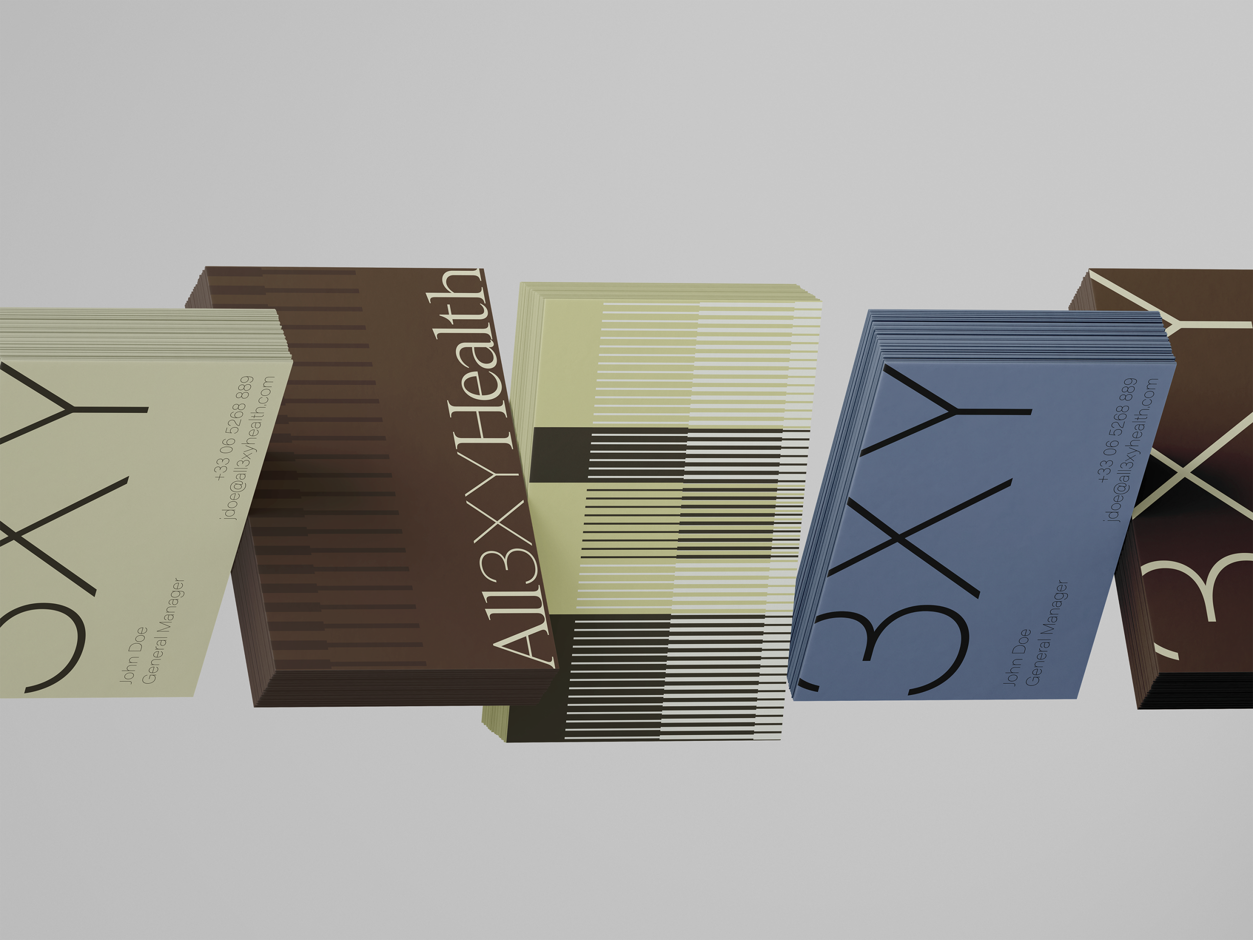
All3XYHealth
Six guiding words reduced to four territories. A pictogram inspired by the microscope slide. Five named colors, two typefaces with distinct roles.
-
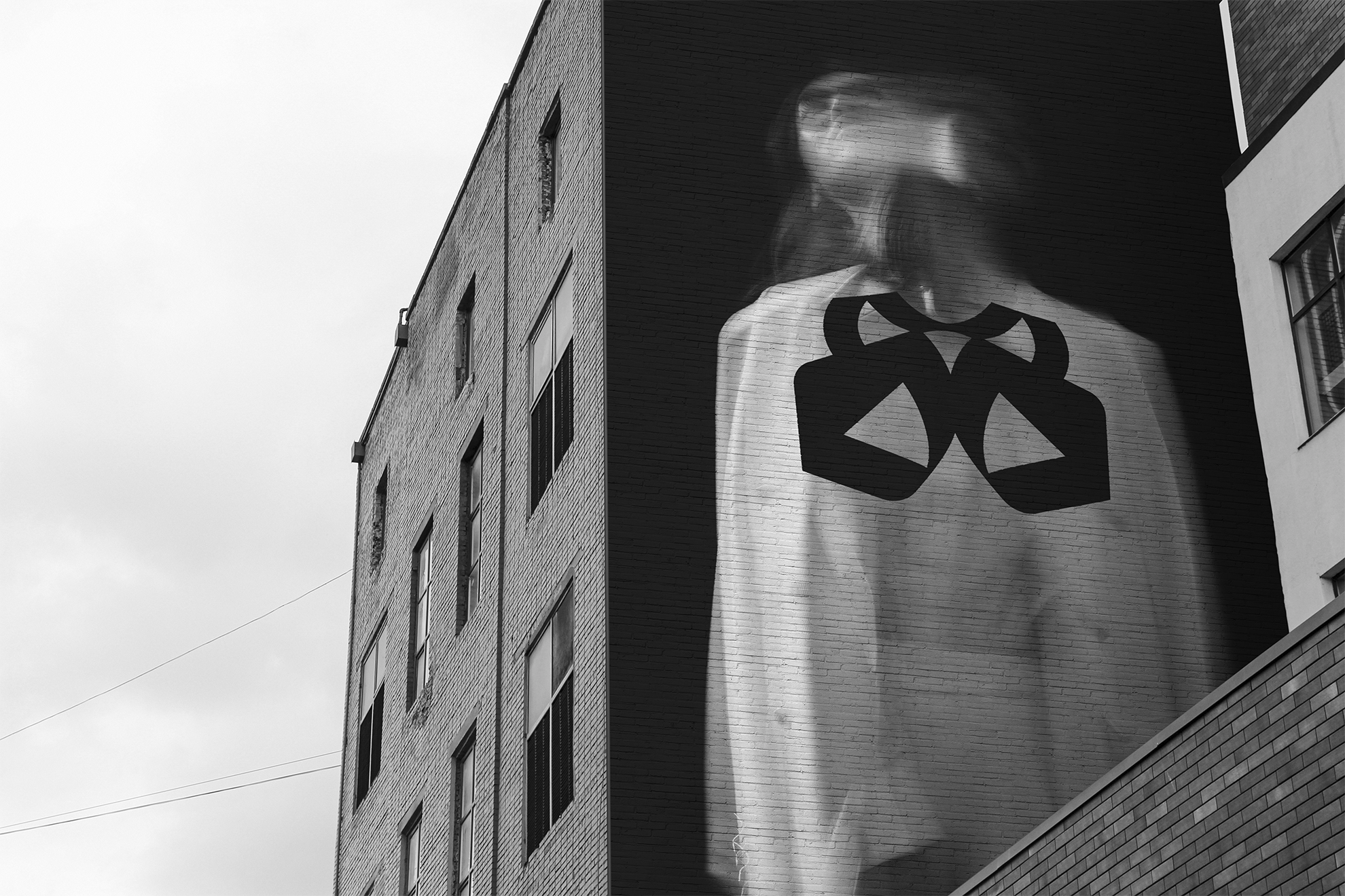
Santino d'Antonio
Five values, three symbols merged into a single mark. The mirrored gothic S opens into two moth wings. Platinum and concrete, one typeface.
-

Luma Spirits
Four visual archetypes as a starting point. Illustrations drawn from the gin’s ingredients. A palette that differs by variant.
-

PCQ
A conservative first proposal, then discarded. An abstract system of lines and openings born from the lighthouse metaphor. Rational typography on a grid.
-

Edil Ferri
Three entities communicating separately. An architecture that holds together Edil Ferri, Dinamica Progetti and Ferri Contract. A manual with 29 documented projects.
-

Scatolificio Pozzi
The starting point wasn’t the blank page but an analysis of the historic logo. The symbolic capital built up over time isn’t thrown away: it’s used as design material.
Decision traceability
Why the sequence matters more than aesthetics
A logo is judged in three seconds and debated for weeks. What makes a choice defensible isn’t its aesthetic quality, which is subjective by definition, but the sequence that produced it.
“The difference isn’t between choosing one green and choosing another green. It’s between choosing a green and being able to say where it comes from, which territory it answers to, what it carries with it.”

On Santino d’Antonio, the brainstorming produced words before shapes: rebel, freedom, ink, tar, smoke, night, profane. Three symbols came out of those words. Whoever has to defend that mark inside the company two years from now has a story to tell, not a taste to impose.
The false signal: the proposal that wins people over right away
An identity process that doesn’t go through at least one discarded proposal usually hasn’t moved anything.
The mark approved in the first round is almost always the one that doesn’t change perception, because it’s liked precisely for resembling what came before. We tell the client at the kick-off rather than halfway through. Finding out halfway through costs time, budget and mutual trust.
The number of rounds is determined by the distance between where the brand is and where it needs to get to. Not by a fixed number set in advance.

On PCQ, the first proposal was conservative. It kept the sector’s codes, reassured the client, and it’s not the one that went through. The project turned when a different concept came in: not control, but guidance. The lighthouse metaphor led to a system that has nothing in common with the first idea.
System and durability
Counting assets doesn’t measure how well a system holds
Five colors, two fonts, one manual: these numbers help gauge the breadth of a system, not its quality. A rich identity that nobody can apply is worth less than a lean one that holds up on every format and with every supplier.
Only one figure really matters: how many years it lasts without touch-ups, and how many different people can apply it without calling the agency.
-
Edil Ferri
Multiple architecture
Three business units to keep coherent under a single identity. The central deliverable wasn’t the mark but the manual that codifies fonts, colors and applications across every touchpoint. Without that standard, the identity falls apart at the first outside supplier.
See the case -
Kömmerling
Local adaptation
Bringing an identity decided by the German parent company to the Italian market, keeping international consistency without consumers perceiving it as imported. A completely different kind of work from building from scratch.Bringing an identity decided by the German parent company to the Italian market, keeping international consistency without consumers perceiving it as imported. A completely different kind of work from building from scratch.
See the case -
Scatolificio Pozzi
Symbolic capital
Almost seventy years of history and an image that stayed unchanged for decades. The starting point was an analysis of the historic logo: understanding its symbolic value before reformulating anything. The capital built up over time isn’t thrown away, it’s used as design material.
See the case
Rebranding
When there’s already something to start from
When a brand already exists, expectations already exist: from customers, employees, partners. Some are an asset to preserve, others a liability to overcome. Telling one from the other is the analysis work that precedes any visual choice.
The market tends to treat a rebranding as a simplified version of an identity from scratch. It isn’t.
The problem wasn’t a single mark to update but three entities communicating separately with no shared system. The solution wasn’t to pick one of the three and make the others conform, but to build an architecture that held Edil Ferri, Dinamica Progetti and Ferri Contract together as parts of the same group. The result is a manual with twenty-nine documented portfolio projects.

Multiple brand architecture is one of the most common problems in companies that grow through acquisition or diversification.
It is also one of the least addressed by what the market offers.
Visual grammar
The visual system as a language: typography, color, shape
Typography
The most underrated factor
On All3XYHealth, two typefaces with assigned roles perform different functions within the same system: one carries the science, the other carries the wellbeing. They aren’t interchangeable. Swapping them produces a system that says different things, even if it looks visually the same.
Color
Tension and differentiation
On Santino d’Antonio, platinum and concrete build the same tension as the mark: not one dominant color with a supporting one, but two colors in balance. On Luma Spirits the palette changes by product variant, requiring a system that allows differentiation without losing coherence.
Shape
The riskiest choice
On PCQ the shape is abstract and built on a grid. It doesn’t represent anything recognizable, but communicates through the structure of its lines and openings. It’s the hardest choice to defend without a documented chain of decisions. With the chain, it becomes the most solid.
Honesty about data
Decision traceability is a form of accountability different from ROI.
It doesn’t measure the economic effect of the mark, which depends on too many external variables. It documents the quality of the process that produced that mark, which is the only thing the agency truly controls. It’s a form of honesty toward the client and toward the market.
What we can show are the results of the ecosystem the identity works within, kept separate and declared for what they are.
On Sani.In.Veneto, 776,618 people reached with €9,110. On LKQ RHIAG, a 34.6% growth in the Meta user base. On You&Meat, over 44,000 packs sold of a limited edition, up 20.61% year on year. These are distribution and sales figures, not branding figures. Anyone who presents them to you as proof of a logo’s return is selling you a correlation.
FAQ